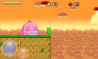
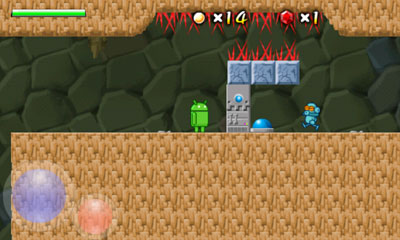
Yesterday I uploaded the first update to Replica Island is something like six months. This update corrects some bugs (most importantly, a crash that could occur in some situations related to a divide-by-zero case in the collision system), adds some features (apps to sd support, on-screen control pad, linear story mode, level select mode, game-over statistics), and a bunch of minor edits and clean-up (I added, for example, the name of the current level when the game is paused).
I worked on this update off and on for the last six months. It originally was designed with other goals in mind; I had planned to add an achievement system, along with a couple of other superfluous modes. In the end I cut it back to the key requests from users: a way to select levels after beating the game, more statistical information, and on-screen controls for multitouch capable touch screens). The achievement system sounded good on paper but ended up being useless, which is why I cut it: the game has been on Market nowadays that just playing it normally for achievements isn't exciting enough, and I don't have time to properly back achievement challenges up with new content or modes. So I dropped that part and shipped the damn thing, finally.
I made a couple of changes to the game design which I thought were interesting.
First, I changed the robot spawners so that they can no longer be possessed by the possession orb. This was a difficult change for me to make, because I really liked having that easter egg in there, but it was the right move: the number of users who complained about the frustration of accidentally possessing the spawner instead of the robot would astound you (and then there are the folks who thought it was a bug). Once I changed it, the advantage to game play was clear. I should have come up with a harder-to-find easter egg.
Second, I modified the Shadow Slime character. This is a black puddle of goo that rises up into an energy-ball-spitting monster when the player gets close. The problem with this guy is that if you are moving really fast, you don't have any time to maneuver out of the way before the Shadow Slime pops up and kills you. Half the time you can't even see the guy. Also, because the Slime was coded to pop up and then drop back down based on distance, it doesn't often get a chance to shoot its energy bolt out. Changing the Slime to never hide improved this enemy a lot: he's more visible, less of a cheap surprise hit, and he actually gets to fire. On later levels, this guy can be pretty rough to deal with, which is exactly how he should be.
Speaking of difficulty, I also added three difficulty modes: Baby, Kids, and Adults. "Regular" Replica Island game play up until now is the "Kids" level. "Adults" is harder than usual and "Baby" is (much) easier than usual. Playing the game on Adults is really fun, even for me (and generally speaking, I have trouble enjoying games I've worked on for a long time). With the level of challenge increased, careful movement and precision attacks are required, which adds a lot to the experience. It was also a great way to test the new on-screen control pad I added; beating the game with those controls on Adults mode required a lot of tuning.
I spent a lot of time thinking about how to name the difficulty modes. My goal is to accurately represent the level of difficulty of the game, but also to challenge certain types of players into selecting a mode that will provide an accurate level of challenge. Some players are extremely casual; they want to see the content and read the story but are not interested in precision game play. Other players are hardcore, and like being hardcore; besting difficult gameplay is a point of pride for them. The difficult users are the semi-casual users; these are players who might not be that interested in the game yet, but once they get into it are likely to play through to the end, even if it's a little hard. The semi-casual user will quit, however, if the game gets hard or frustrating early on; unlike the hardcore player, completing a challenge isn't a point of pride for these players.
To make this game as accessible as possible, I need difficulty levels that speak to each of these types of players. "Baby" is a good name for the very easy mode because it's something that a player who prides himself in a challenge will avoid. It also communicates that the player need not be intimidated by the game mechanics, which should help those who just want to see the content. "Kids" is also a good middle ground; for players who don't care too much about accomplishment, but are still interested in a bit of challenge, this describes that level in a non-condescending way. "Adults" suggests that only real gamers apply, which is the message you want to give to a hardcore user.
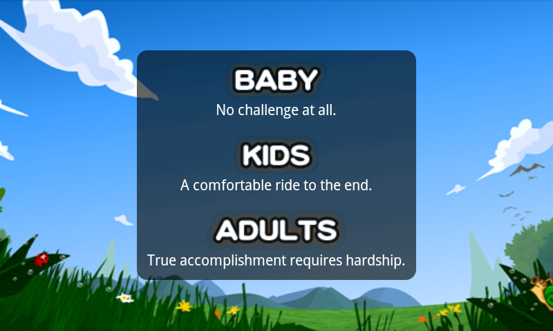
To back these difficulty level names up, I added short descriptions to each. You can see what they look like in this screenshot. Again, the goal was to separate players who want a little challenge along with their game and players who'd prefer to have a little game along with their challenge. I'm pretty happy with the wording.
But the biggest change I made with this update was the addition of on-screen controls. I'll write about the design of that system when I get the chance.
Showing posts with label game design. Show all posts
Sunday, January 16, 2011
Sunday, April 11, 2010
Design Post-Mortem: Three Mistakes
While I'm pretty happy with Replica Island, releasing it has definitely been a learning experience. Some of the design choices Genki and I made were good, others were ok, and a few were bad. Today I'm going to talk about three mistakes I made in the design of this game.
Mistake #1: This particular jump.
Turns out that a lot of players die right here. Heck, I have the metrics to prove it. This is sort of a difficult jump because you have to make it across a wide pit and then land in a very small space near the top of the screen. This jump started out a little easier, but it got harder when I compressed the vertical size of this level to deal with some camera problems. The real problem here, though, is the distance. It turns out that this is the first spot in the game where you are required to use second-order flying skills to reach the other side.
Just what is that skill? Well, it turns out that some players never realize that they can stay aloft for longer if they let momentum rather than fuel carry them forward. If you press the jump button and get your speed up in the air, you can release the jump button and stay aloft until gravity overtakes you and you begin to fall. At that point you can hit the jump button again to combat gravity and maintain your altitude. You can't do this forever because you'll eventually run out of fuel, but using this method you can jump much greater distances than if you just hold the jump button down constantly.
The real problem is that I never teach players how to fly that way explicitly. There is lots of tutorial levels designed to make sure you can fly, but it turns out that only the most basic flying skills are required to get passed those sections. This area is the first in which you cannot progress unless you've figured out how to use the more complex flight mechanics, and people get stuck here.
What can I do about it? Probably this area itself is fine; a better tutorial on this particular skill is probably in order.
Mistake #2: The Case of the Robot Spewing Spawner
When I made the robot spawners, I though it would be a funny easter egg if you could possess them. Part of the plan was to allow the possession orb to possess any machine, and I thought possessing the spawners would be a little hidden reward for users that experiment. The problem is, I added this functionality before we understood how the robot puzzles were going to work; in the final game, it's trivially easy to possess a spawner, and most users are confused rather than elated. Even worse, being able to possess a spawner sometimes gets in the way of possessing a robot, which is pretty annoying. I realized that this might be a problem before we released the game, but I left it alone because I thought it was funny. Now there are multiple videos about it. Pretty undeniable proof that I messed this up.
What should I do about it? I should probably turn the easter egg off or at least find a way to make it much harder to find.
Mistake #3: The impossible puzzle.
You have no idea how many people have e-mailed me about this puzzle. It's clearly the most difficult part of the game for a huge number of users.
In the first version of the game, this section was missing the red spikes due to a bug in the level data, which made this puzzle even more confusing. But even after fixing that, I continue to get several e-mails a day asking about this part.
If you don't want this puzzle spoiled for you, stop reading now.
OK, I warned you. The solution here is to use the Possession Orb to grab the robot and run him into the button. Pretty simple, I thought; the real challenge in this puzzle's original form was actually just maneuvering the Orb through the spikes before it dissipates (in an update I added a gem to this level, so the Orb survives for longer). But it turns out that users weren't even figuring out that they could use the Possession Orb here, even though they've seen this pattern several times in slightly different contexts earlier in the game.
I finally realized what the real failure is here: players don't realize that the Orb can fly. The tutorial says something like, "tilt the phone to control the orb," but if you never try tilting it up, you'll never learn that the Orb can fly. I think that players also forget that the Orb is in their arsenal, but they'd probably figure that out eventually. Not expecting it to be able to fly means that many don't even try it. This is a fundamental teaching failure on my part and makes this puzzle a whole lot harder than it was intended to be.
What can I do about it? Well, as a first step, the tutorial level should force you to send the ball up at some point. After that though, the game needs to reenforce the fact that the Orb can fly, so I'll probably need to modify some levels to encourage that behavior.
The great thing about this is, I can fix the problems and send out an update and see if my fixes were successful. And if not I'll try again. Traditional video games have never had this sort of ability to iterate interactively with the audience, and I'm really learning a lot from it.
Tuesday, March 23, 2010
Design Post-Mortem: The Possession Orb
Rather than write a big long post-mortem of how developing Replica Island went, I'm thinking about writing smaller articles that focus on a single element of development. Just because the game has shipped does not mean that development is over, and I'm sure that I have much more to learn now than I did before the game shipped. And speaking of the game's release, it's tearing up the charts, thanks to Nicholai and his crack team of PR ninjas (ok, he doesn't really have any PR ninjas). This article, despite being ultra thin on details, seems to have reached a lot of users. I'll post more details soon.
The Possession Orb did not originally start out as an orb. And actually, it didn't originally have anything to do with possession either.
My original design for the Possession Orb was called the Player Ghost. The idea was that the player could drop the ghost somewhere in the game world, and after a few seconds it would begin to replay the player's recent movement. At any time the player could click a button and instantly teleport back to the ghost's current location--it was like a way for the player to undo a few seconds of movement. The ghost, I figured, could also press buttons, so there could be timing challenges involving hitting buttons with the player's body and then again a few seconds later with the ghost.
I got this idea from a crazy Nintendo Entertainment System game called Lot Lot. Lot Lot is a puzzle game in which two cursors move across a board filled with balls. One cursor is under the player's direct control, and the second cursor is following the path of the first, but about two seconds delayed. When the player's cursor is over a grid square that has balls in it, the player can press a button to swap those balls for the ones in the square pointed to by the second cursor. So game play consists of thinking about where you want the two cursors to be, drawing a path that you know will be correct two seconds into the future, and then hitting the button at the right time to shift balls to the edge of the board before they fill up. It's very difficult to understand at first but once it clicks the game play is crazy. Here's a video of Lot Lot in action:
So, my idea was that the Player Ghost would be like Lot Lot's second cursor: a replay of the player's recent movement that could still affect the game world.
Here's some early design sketches I made about this idea:
Sounds cool, right? I thought it would be cool if you could snap back to the ghost's location too.
I liked this idea, but when I ran it by Genki, my partner in crime, he was skeptical. He thought that puzzles would be hard to design and that users would have a hard time understanding the mechanic. But I wanted to try it out so I went ahead and implemented it anyway.
Functionally, the Player Ghost worked exactly as I had imagined. It wasn't hard to implement and it actually looked pretty cool. But it quickly became clear that Genki was right: the concept made no sense and designing puzzles was really hard. It was clear that puzzles were going to require a bunch of different objects just so that the ghost could work (e.g. doors that close immediately after you pass through them, rather than after a fixed duration), which lowered the quality of the idea significantly. And it was confusing as heck; I wasn't confident that even with supporting game objects the idea would ever really make sense to users.
Genki suggested that instead of the player leaving the ghost behind, the ghost should leave the player behind. This idea made a lot more sense, but I wasn't sure how to make puzzles out of it. Eventually we realized that possession is a cool mechanic that the ghost could be useful for (rather than just depressing buttons), and that tilt controls might be a fun way to add diversity to the input system. Tilt controls implied flying, so the ghost was freed from gravity. And at that point, it didn't make any sense for it to look like the Android robot any more, so we changed it into an orb (collisions with the background were more believable this way too).
Once we hit on the mechanic a lot of potential avenues for game design immediately presented themselves, which was a good indicator that the idea had more legs than its original version. Actually, I think that this mechanic is quite under-used in Replica Island. There's a lot more that we could have done with it, and actually tested with it, that didn't make it into the final game (try running the Possession Orb into a turret, for example). Maybe this is something to experiment with in a future update.
Wednesday, January 13, 2010
The Elusive Perfect Platformer Camera
I've come to believe that platformers live and die by their camera system. The camera system is the code that decides how the player should be centered in the frame. The camera must somehow track the player as he moves such that the player can see what's coming. That might seem like a simple problem, but it's not. In fact, I'll go out on a limb and say that a bad (or even mediocre) camera system can ruin a 2D scrolling platformer game.
I mentioned in a previous post that the data coming back from my play testers showed them dying in droves in bottomless pits. I guessed that this had to do with the camera system scrolling up and down, and I was right; a review of the camera code revealed a lot of room for improvement, and after some tuning and bug fixing, I think the experience is much improved.
But this experience again drove home the point I made in the intro paragraph: that the camera in a 2D scrolling platformer has the potential to affect the play experience dramatically--it has to be as perfect as possible. I've made a lot of side-scrollers before, and I should know this, but I was still surprised by how much play was improved by a few simple camera tweaks.
If you are ever at a loss about what to do when it comes to 2D platformer design, refer back to Super Mario Bros. It's like the bible of platforming games--every problem that you might encounter has already been solved, and it's probably been solved in a way that works better than whatever you came up with. At least, that's been my experience. Take a look at this video from Super Mario Bros. 3. Pay attention to the amount of vertical scrolling that the game does when the player gets close to the top of the screen.
You can see that the game almost never scrolls vertically. The really interesting case is around 0:56, where the level (which has previously refused to scroll vertically) scrolls up in one very specific point to get the secret 1up. It's like vertical scrolling is only allowed in very specific situations. You can also see this sort of logic at work when Mario grabs the tanuki suit and starts to fly--immediately the game begins to follow him vertically.
Now compare the camera movement in Mario to the video below. This is Frogger Advance: The Great Quest, a GBA game that I worked on all the way back in 2001.
Quite a difference, right? The camera is all over the place, but despite all of the motion it's pretty much impossible to see where you are going. Part of the problem is that Frogger himself is really big; he takes up so much space on the screen that the camera really has to move just to keep him in the frame. This is a leading camera--it's supposed to always show you the direction that that you are moving. But in practice the physics are so fast that even if the camera rushes to show what's coming up, the player doesn't have time to react. When we made this game we understood that players were dying because they couldn't see where they would fall after a jump, but we didn't understand what to do about it. If you watch this video, you'll see the player use Frogger's float move to slow his falling motion down; this move was added explicitly to combat fall-into-pit deaths. A better solution would have been to try to reduce the amount of movement of the camera by designing levels that don't need to scroll vertically and reducing the size of the main character.
For Replica Island, my camera algorithm is based on the concept of a "window." I actually thought of it as a sphere when I wrote it, but my good friend and ultra-veteran platformer author gman pointed out that it's more accurate to think of a window. The center of the screen is defined by the center of the window, so when the window moves, the game scrolls. The rule that the camera's target (the player) must always remain within the window. When the player crosses out of the bounds of the window, the camera must move the window so that it contains the player at his new position. However, as long as the player stays within the window the camera does not move. So the player is able to cause scrolling in a particular direction by pushing up against a side of the window.
To fix the levels in which huge numbers of users were dying, I adjusted the bounds of the window so that almost no scrolling occurs in the Y axis until the player approaches the top of the screen. The camera also does not allow the player to move below the middle of the screen. So now a small jump causes no vertical camera movement, but hopping off a ledge keeps the player right in the center of the display. This makes seeing what's below you a lot easier than before.
But the heuristic wasn't good enough on its own, so I've also added a special object that, when visible, biases the camera in one direction or another. This lets me put camera hints in the map in areas that I know to be particularly problematic.
Finally, on a few levels I squeezed the level size down so that there's almost no vertical scrolling at all. This makes these levels feel a bit more like Mario, as the game almost never scrolls up and down. This makes the jumping puzzles actually fun, rather than one leap of faith after another.
So far I'm pretty happy with the results, but the real test will be to compare this new version of the code and levels with the data that I presented before; if my theory is right, the number of deaths from falls should be dramatically reduced. If I'm wrong, well, it'll be another round of iteration. It's worth it though; bad cameras are the death of 2D scrolling games.
I mentioned in a previous post that the data coming back from my play testers showed them dying in droves in bottomless pits. I guessed that this had to do with the camera system scrolling up and down, and I was right; a review of the camera code revealed a lot of room for improvement, and after some tuning and bug fixing, I think the experience is much improved.
But this experience again drove home the point I made in the intro paragraph: that the camera in a 2D scrolling platformer has the potential to affect the play experience dramatically--it has to be as perfect as possible. I've made a lot of side-scrollers before, and I should know this, but I was still surprised by how much play was improved by a few simple camera tweaks.
If you are ever at a loss about what to do when it comes to 2D platformer design, refer back to Super Mario Bros. It's like the bible of platforming games--every problem that you might encounter has already been solved, and it's probably been solved in a way that works better than whatever you came up with. At least, that's been my experience. Take a look at this video from Super Mario Bros. 3. Pay attention to the amount of vertical scrolling that the game does when the player gets close to the top of the screen.
You can see that the game almost never scrolls vertically. The really interesting case is around 0:56, where the level (which has previously refused to scroll vertically) scrolls up in one very specific point to get the secret 1up. It's like vertical scrolling is only allowed in very specific situations. You can also see this sort of logic at work when Mario grabs the tanuki suit and starts to fly--immediately the game begins to follow him vertically.
Now compare the camera movement in Mario to the video below. This is Frogger Advance: The Great Quest, a GBA game that I worked on all the way back in 2001.
Quite a difference, right? The camera is all over the place, but despite all of the motion it's pretty much impossible to see where you are going. Part of the problem is that Frogger himself is really big; he takes up so much space on the screen that the camera really has to move just to keep him in the frame. This is a leading camera--it's supposed to always show you the direction that that you are moving. But in practice the physics are so fast that even if the camera rushes to show what's coming up, the player doesn't have time to react. When we made this game we understood that players were dying because they couldn't see where they would fall after a jump, but we didn't understand what to do about it. If you watch this video, you'll see the player use Frogger's float move to slow his falling motion down; this move was added explicitly to combat fall-into-pit deaths. A better solution would have been to try to reduce the amount of movement of the camera by designing levels that don't need to scroll vertically and reducing the size of the main character.
For Replica Island, my camera algorithm is based on the concept of a "window." I actually thought of it as a sphere when I wrote it, but my good friend and ultra-veteran platformer author gman pointed out that it's more accurate to think of a window. The center of the screen is defined by the center of the window, so when the window moves, the game scrolls. The rule that the camera's target (the player) must always remain within the window. When the player crosses out of the bounds of the window, the camera must move the window so that it contains the player at his new position. However, as long as the player stays within the window the camera does not move. So the player is able to cause scrolling in a particular direction by pushing up against a side of the window.
To fix the levels in which huge numbers of users were dying, I adjusted the bounds of the window so that almost no scrolling occurs in the Y axis until the player approaches the top of the screen. The camera also does not allow the player to move below the middle of the screen. So now a small jump causes no vertical camera movement, but hopping off a ledge keeps the player right in the center of the display. This makes seeing what's below you a lot easier than before.
But the heuristic wasn't good enough on its own, so I've also added a special object that, when visible, biases the camera in one direction or another. This lets me put camera hints in the map in areas that I know to be particularly problematic.
Finally, on a few levels I squeezed the level size down so that there's almost no vertical scrolling at all. This makes these levels feel a bit more like Mario, as the game almost never scrolls up and down. This makes the jumping puzzles actually fun, rather than one leap of faith after another.
So far I'm pretty happy with the results, but the real test will be to compare this new version of the code and levels with the data that I presented before; if my theory is right, the number of deaths from falls should be dramatically reduced. If I'm wrong, well, it'll be another round of iteration. It's worth it though; bad cameras are the death of 2D scrolling games.
Friday, January 1, 2010
Tuning With Metrics Redux
A while back I posted about the system I devised for recording player deaths and plotting them on level images to find trouble spots. Since then I've improved the system a little and written some more tools to crunch the data I am receiving. Several hundred players have now participated in testing Replica Island, so I have quite a lot of feedback to process. The goal, of course, is to use anonymous statistics about play (specifically, where players died) to smooth out the difficulty curve and find frustration spikes.
Rendering death locations on level maps is a good way to go about tuning individual levels, but what about the game as a whole? I now have enough data to look at how players move through the game. Maybe I can draw some conclusions about how the game is paced and how smoothly the difficulty increases.
The first thing I did is graph the number of deaths for each level. That graph looks like this:
But one thing this data doesn't tell me is how frustrating these levels are. Just because a player died more than once doesn't mean that the level was frustrating; consider a poorly constructed level in which the player isn't in immediate danger but simply cannot progress. In a case like that, the level could be extremely frustrating without the player dying a lot, and this graph wouldn't catch it.
Let me tell you more about the data I have. I collect a few basic fields for each event. They are:
Rendering death locations on level maps is a good way to go about tuning individual levels, but what about the game as a whole? I now have enough data to look at how players move through the game. Maybe I can draw some conclusions about how the game is paced and how smoothly the difficulty increases.
The first thing I did is graph the number of deaths for each level. That graph looks like this:
As you can see, a few levels jump right out: levels 17, 21, 39, 32, and 34 all look like spikes in the death graph. My theory here is that the game should get harder at almost exactly the same rate that the player gets better, so I would expect the number of deaths per level to stay uniform across the entire game. And actually, this graph suggests that with the exception of the outliers mentioned above, I'm doing an ok job at keeping the difficulty increasing at a constant rate. After fixing the very hard levels, I can see that the middle of the game, from around level 11 to level 24, there are some very easy levels as well. I should probably go back and mix those up a bit to increase the difficulty. So far, so good. Looks like this is a pretty good metric for assessing difficulty.
But one thing this data doesn't tell me is how frustrating these levels are. Just because a player died more than once doesn't mean that the level was frustrating; consider a poorly constructed level in which the player isn't in immediate danger but simply cannot progress. In a case like that, the level could be extremely frustrating without the player dying a lot, and this graph wouldn't catch it.
Let me tell you more about the data I have. I collect a few basic fields for each event. They are:
- event type - the type of event that occurred. Usually "death."
- x, y - the position in the level in which the event occurred.
- time - the time since the level started, in seconds, until the event.
- level - the level in which the event occurred.
- session - a unique session key associated with the user (based on a random number generator).
For the first version of the game that I sent out to testers, only death events were recorded. In the most recent version I added a new type: level completion events. When a level is completed, it causes that event to be logged to the server. With level completion events in place I can now track the total amount of time that a player spent on any given level by summing all of the time entries from death events associated with that user on that level and adding the result to the level complete time event. Do this for every user and average the results and I can get a graph of how long each level takes to complete including restarts from death. That graph looks like this:
Now, Replica Island is a game on a phone. It needs to be playable in short bursts. So my levels are all designed with the idea that you can finish them in around 5 minutes. And looking at the graph, it looks like my levels are pretty much in-line with that expectation. Levels 32 and 34, which were outliers on the deaths per level chart, are again outliers here; those levels must really suck. I mean, it's the end of the game, so the levels are supposed to be pretty hard, but the average player dies 8 times on level 32 and spends a total of almost 20 minutes trying to complete it. That's probably super frustrating. That level needs work.
I can also see that there's something very wrong with level 18. People are completing it in almost no time whatsoever, even though the other graph shows that most people die 2.25 times on that level. And again, with the exception of the very long outliers, I can see that the levels in the end are sometimes too easy; ideally all the bars on this graph should rarely vary from the 5 minute mark.
Of course, these are all averages. Some players might spend a very, very long time on a particular level (and actually, with my expanded view of the data, I can see some poor souls really are getting stuck for hours). But on the other hand, I can't design levels for every level of difficulty; hitting the perfect median that is challenging for novices but not boring for pros is hard, but I think that averages are a good guideline.
So now I know which levels are probably worth investigating. A cursory look at the levels identified by the death event graph revealed an interesting pattern: a lot of people seem to be dying by falling down pits. Replica Island, like many other side-scroller games before it, features pits that you must jump across. If you fall down a bit and off the bottom of the level, it's game over. It turns out that many of the levels in which people are dying in droves are levels that feature a lot of pits, like this one:
Every little dot on this image is a player who died, and 99% of them are in pits. So it seems like I might have a problem with pits that affects a lot of different players. Rather than make that assumption, however, I graphed it:
I can detect a pit death from my data because the y coordinate in my x,y field goes negative only in this case. And yep, it looks like levels with a lot of pits are deadly.
So how pervasive is this problem? I know by looking at the death event graph and the completion time graph that I've got some outlier levels to deal with, and this latest graph tells me that some of the levels are affected by some specific problem with pits. So what's the relationship between the pits and the overall level flow that I'm trying to control? Let's graph it and find out!
This is pretty neat, right? I can tell that in several cases, in particular level 34, the pit problem is leading to a lot of deaths which is causing the level to take forever to complete. I can also see that the pit issue isn't my only problem: problematic level 32 has almost no pits, and yet the number of deaths and the time to complete that level is still way out of range compared to the rest of the game.
In case you are interested, the problem with pits is actually pretty simple: my camera moves too much in the vertical direction. Classic platformers that involve a lot of jumping, like Super Mario Bros., are very careful to limit the amount of vertical movement required by the camera when making jumps. You can always see the landing point before you leave the ground in the Mario games, which makes jumping over pits a fun challenge rather than a frustrating penalty. But in Replica Island, the protagonist can fly, which requires the camera to track in the vertical axis a lot more aggressively. That means that if you are falling you might not actually realize that there isn't going to be any ground below you until it's too late. The solution to this problem is probably to make the camera smarter about pits, and maybe to throw some visual indicator into the mix as well. We'll see--I have a couple of solutions in mind but it'll take another round of testing to verify them.
Anyway, based on an extremely simple packet of data from a sample of several hundred players, I can pretty accurately pinpoint levels that need polish and game mechanics that are sources for error. As I push forward to a public release, my goal should be to first fix the mechanical issue (the pit problem), and then polish levels like #32 that are broken for some other reason. That's a much better task list than just some gut feeling about the quality of my levels.
Sunday, November 8, 2009
Tuning Play With Automatic and Anonymous Player Metrics
As the developer of an "indy" game (meaning I don't have the backing of a big publisher, though Google is nice enough to give me 1 day per week of work time to spend on this), I have a problem that a lot of us indy developers share: play testing is hard. Play testing is the tried-and-true method of determining the quality of a given game design by watching users who are not experts play. When I worked in the game industry we'd bring kids in to the office, plunk them down in front of a TV that had a game machine and VCR hooked up, hand them a controller, and record their entire play session. This is hugely valuable information because problematic areas in the design are almost immediately identifiable. Nothing settles a design question faster than watching a real user fail to understand what you are trying to get them to do over and over again.
But as an indy developer, I don't have an office, I don't have a pool of play testers to draw from, and I can't easily connect my Android device to a VCR. My experience has been that play testing can vastly improve the quality of a game, so I really don't want to skimp on it. And the common refrain repeated by developers of universally loved, amazingly high-quality games is that they tested and iterated and tested and iterated and tested and iterated again until their game felt right.
For example, Naughty Dog, the rockstar developers behind the Crash Bandicoot series, the Jak and Daxter series, and most recently, Drake's Fortune, has been talking about the value of play testing for years. Back in the Playstation 1 days they pioneered methods for recording metrics about player style so that their levels could be tuned to increase in difficulty gradually. On top of that, their Crash Bandicoot series is a poster child for Dynamic Difficulty Adjustment (DDA), an automated system for dialing a game's difficulty up or down as the player plays to keep the level of challenge constant (full disclosure: I worked on a couple of Crash games for GBA at Vicarious Visions). Their goal is for the user to never see the game over screen; if the player dies repeatedly in the same spot, that indicates a failure of the design. With DDA and play testing, Naughty Dog has been extremely successful in smoothing out these "difficulty cliffs" and, as a result, their games get a lot of love.
So with these lessons in mind I released a build of Replica Island to Google employees about two weeks ago. Since I can't stand over every player's shoulder and watch them play, I asked for people to tell me about bugs that they encountered and provided a very short survey form at the end. Though a lot of people downloaded the game and tried it out, very few bothered to fill out the survey and even fewer wrote me directly about their thoughts. I learned a few things about my game but I did not collect not nearly the amount of information I need to tune my level design and game play decisions for a mass audience.
Fortunately, I also built some automated metric recording functionality into the game. Taking a page from Naughty Dog's book, I decided to focus on death locations: every time a player dies, I want to know about it. Looking at the aggregate results over a number of players should reveal hotspot areas where lots of people died; these areas are the first candidates for polish and tuning. So I added a very simple function to ping a web server every time the player dies and restarts the level. The ping carries no information about the user himself: just which level he is playing, where he died, and a session identifier so I can see if people died multiple times in the same place. After I released the game to Google employees the data began to roll in, and after a while I started to have enough information to be statistically relevant.
Once I had the data, I needed to decide how to use it. This is still a work in progress, but here's how I'm using it so far.
This is an image of an early level in Replica Island. The little colored dots represent death events from various users (each user is a unique color). As you can see, there's a couple of obvious spots where a lot of users died. (Actually, this is only part of the data I have received so far--the quality of the results increases as more players respond).
This spot is where the player encounters an enemy robot, one of the first in the game. This is a significant example because it takes place so early in the level; deaths in this location mean that the user got hit here at least three times, as there's nothing earlier in this level that can reduce the player's life. Also, now that the data has singled this location out, I can see why it's problematic; the low ceiling makes the Android's butt-stomp move (which is the only attack he has in the game) hard to pull off for novice players, and the slope likely causes people who are not used to the physics to roll down right into the enemy. This is a failure of the level design: I really don't want first-time players to die after playing a few seconds into the first or second level. Fortunately, the solution is simple: in this case I can just remove the enemy from that location.
Though this type of metric reporting and visualization is pretty rudimentary, it has already proven extremely valuable in identifying problematic level segments. It's also confirmed one of the conclusions that I drew from the survey feedback: nobody reads on-screen text, so in order to teach the player how to play I need to use big, visual indicators and design levels to require specific moves.
I am so happy with these results that I'm thinking of expanding the level and frequency of the events that I report; it would be great to know where players take the most damage, or which pits they fall down the most, or how long player spent traversing specific level segments. Now that the framework for event reporting and visualization is in place, it is pretty easy to add new types of events to it.
In fact, I could even release the game with this system turned on. It's probably a good idea to let the user opt-out if they want (even though I don't transmit anything personal), and I'd rather do my test and polish before the game is released, but leaving these metric reporting systems in place for the full release is very tempting. It would give me real, concrete data to tune and improve Replica Island even after it has been released.
But as an indy developer, I don't have an office, I don't have a pool of play testers to draw from, and I can't easily connect my Android device to a VCR. My experience has been that play testing can vastly improve the quality of a game, so I really don't want to skimp on it. And the common refrain repeated by developers of universally loved, amazingly high-quality games is that they tested and iterated and tested and iterated and tested and iterated again until their game felt right.
For example, Naughty Dog, the rockstar developers behind the Crash Bandicoot series, the Jak and Daxter series, and most recently, Drake's Fortune, has been talking about the value of play testing for years. Back in the Playstation 1 days they pioneered methods for recording metrics about player style so that their levels could be tuned to increase in difficulty gradually. On top of that, their Crash Bandicoot series is a poster child for Dynamic Difficulty Adjustment (DDA), an automated system for dialing a game's difficulty up or down as the player plays to keep the level of challenge constant (full disclosure: I worked on a couple of Crash games for GBA at Vicarious Visions). Their goal is for the user to never see the game over screen; if the player dies repeatedly in the same spot, that indicates a failure of the design. With DDA and play testing, Naughty Dog has been extremely successful in smoothing out these "difficulty cliffs" and, as a result, their games get a lot of love.
So with these lessons in mind I released a build of Replica Island to Google employees about two weeks ago. Since I can't stand over every player's shoulder and watch them play, I asked for people to tell me about bugs that they encountered and provided a very short survey form at the end. Though a lot of people downloaded the game and tried it out, very few bothered to fill out the survey and even fewer wrote me directly about their thoughts. I learned a few things about my game but I did not collect not nearly the amount of information I need to tune my level design and game play decisions for a mass audience.
Fortunately, I also built some automated metric recording functionality into the game. Taking a page from Naughty Dog's book, I decided to focus on death locations: every time a player dies, I want to know about it. Looking at the aggregate results over a number of players should reveal hotspot areas where lots of people died; these areas are the first candidates for polish and tuning. So I added a very simple function to ping a web server every time the player dies and restarts the level. The ping carries no information about the user himself: just which level he is playing, where he died, and a session identifier so I can see if people died multiple times in the same place. After I released the game to Google employees the data began to roll in, and after a while I started to have enough information to be statistically relevant.
Once I had the data, I needed to decide how to use it. This is still a work in progress, but here's how I'm using it so far.
This is an image of an early level in Replica Island. The little colored dots represent death events from various users (each user is a unique color). As you can see, there's a couple of obvious spots where a lot of users died. (Actually, this is only part of the data I have received so far--the quality of the results increases as more players respond).
This spot is where the player encounters an enemy robot, one of the first in the game. This is a significant example because it takes place so early in the level; deaths in this location mean that the user got hit here at least three times, as there's nothing earlier in this level that can reduce the player's life. Also, now that the data has singled this location out, I can see why it's problematic; the low ceiling makes the Android's butt-stomp move (which is the only attack he has in the game) hard to pull off for novice players, and the slope likely causes people who are not used to the physics to roll down right into the enemy. This is a failure of the level design: I really don't want first-time players to die after playing a few seconds into the first or second level. Fortunately, the solution is simple: in this case I can just remove the enemy from that location.
Though this type of metric reporting and visualization is pretty rudimentary, it has already proven extremely valuable in identifying problematic level segments. It's also confirmed one of the conclusions that I drew from the survey feedback: nobody reads on-screen text, so in order to teach the player how to play I need to use big, visual indicators and design levels to require specific moves.
I am so happy with these results that I'm thinking of expanding the level and frequency of the events that I report; it would be great to know where players take the most damage, or which pits they fall down the most, or how long player spent traversing specific level segments. Now that the framework for event reporting and visualization is in place, it is pretty easy to add new types of events to it.
In fact, I could even release the game with this system turned on. It's probably a good idea to let the user opt-out if they want (even though I don't transmit anything personal), and I'd rather do my test and polish before the game is released, but leaving these metric reporting systems in place for the full release is very tempting. It would give me real, concrete data to tune and improve Replica Island even after it has been released.
Thursday, September 10, 2009
Why Android Flies
The main mode of movement in Replica Island is flying. The Android robot has thrusters in his feet, and while he can also slide upon the ground, most of the game is spent maneuvering through the air. Enemies are dispatched by dropping on them from above and the collision and physics systems make it easy to glide off of a ramp and into the air. I don't think this is a common approach for side scrolling platformers.
The reason that the Android flies is that many Android devices ship with a trackball. Some (like the Samsung Galaxy) have a d-pad, which works fine as well, but the devices from HTC (which include the G1, myTouch, and Hero) all sport a trackball. The great thing about a trackball is that it's an analog interface with a pretty high resolution. The bad thing about it is that you can't hold a single direction down like you can with a d-pad; to keep sending input events in a specific direction, you have to keep rolling in that direction.
When I started working on Replica Island, I knew that I'd have to do something different with the player controls to afford trackball use. Letting the Android robot fly seemed like a good solution: the player gets going in a certain direction and then only has to make minor adjustments in heading to steer rather than constantly depressing a button indicating the direction that they wish to travel. This sort control scheme is a bit like a car steering wheel--given velocity that you already have you just need to worry about turning left and right. Indeed, in early prototypes it was clear that the trackball would work very well for this sort of analog maneuvering, but I also quickly learned that it's hard to make precise movements with a trackball.
My initial implementation let the player move left, right, and up by rolling the ball, and while it worked and was playable, people had a really hard time moving in only one direction. It was too easy to accidentally roll up a little when trying to go left or right, which made the controls feel unwieldy and arbitrary. After experimenting with dead zones and other input filters, I finally reduced the trackball to horizontal movement and put a jump/fly button at the lower-left hand corner of the screen. This is a much better solution because it allows players to manage their horizontal and vertical velocity independently, much like they can with a d-pad or other traditional game input device. Furthermore, by ignoring vertical movement on the trackball the control scheme became a lot more forgiving to minor input mistakes.
Replica Island is playable with three inputs: the jump/fly button, left and right controls, and a drop/attack button. These three inputs were decided upon to allow the trackball to feel good, but they map well to other input systems (like a hardware keyboard or d-pad) too, so Replica Island is playable on a wide range of hardware.
Once I settled on the trackball-based steering approach for movement, many other aspects of the core game design fell out. I posted earlier about the collision detection system I wrote to support slopes and angles; this system was necessary to allow for ramp and bounce physics. The Android robot can slide across the ground but it's a lot more fun when he's in the air, so I needed to have a collision and physics system that allows him to take flight easily. Sliding down hills or going off ramps feels good and works well with the control scheme.
This approach also simplified animation: if the Android robot is going to fly with thrusters in his feet, he doesn't need a walk cycle, a run cycle, a turn animation, a skid to stop animation, a jump windup or a jump peak or a jump fall animation. His motion system is more complicated than most of the side scrollers I've made in the past but his animation system is extremely simple; the control scheme afforded this simplicity.
As awesome as Android is for games, the devices it runs on are not generally designed explicitly for gaming. To make a fun game, especially one that is part of an established console-oriented genre, you need to come up with a control scheme that works well for the hardware, even if there's not a lot of precedent for it. In the case of Replica Island, I started with the control scheme and the rest of the game design flowed out from there; as a result, I think that it's a quite playable platformer despite its rather unconventional controls.
When making games for this type of system, it's important to consider exactly how the available inputs are going to make the game fun; if you try to just glue controls from some other hardware paradigm onto a game running on a phone the results are almost guaranteed to suck. Getting the controls right is probably the single most important task you have as a game developer, and if you can nail them down early enough, a huge part of your game design will pretty much write itself.
The reason that the Android flies is that many Android devices ship with a trackball. Some (like the Samsung Galaxy) have a d-pad, which works fine as well, but the devices from HTC (which include the G1, myTouch, and Hero) all sport a trackball. The great thing about a trackball is that it's an analog interface with a pretty high resolution. The bad thing about it is that you can't hold a single direction down like you can with a d-pad; to keep sending input events in a specific direction, you have to keep rolling in that direction.
When I started working on Replica Island, I knew that I'd have to do something different with the player controls to afford trackball use. Letting the Android robot fly seemed like a good solution: the player gets going in a certain direction and then only has to make minor adjustments in heading to steer rather than constantly depressing a button indicating the direction that they wish to travel. This sort control scheme is a bit like a car steering wheel--given velocity that you already have you just need to worry about turning left and right. Indeed, in early prototypes it was clear that the trackball would work very well for this sort of analog maneuvering, but I also quickly learned that it's hard to make precise movements with a trackball.
My initial implementation let the player move left, right, and up by rolling the ball, and while it worked and was playable, people had a really hard time moving in only one direction. It was too easy to accidentally roll up a little when trying to go left or right, which made the controls feel unwieldy and arbitrary. After experimenting with dead zones and other input filters, I finally reduced the trackball to horizontal movement and put a jump/fly button at the lower-left hand corner of the screen. This is a much better solution because it allows players to manage their horizontal and vertical velocity independently, much like they can with a d-pad or other traditional game input device. Furthermore, by ignoring vertical movement on the trackball the control scheme became a lot more forgiving to minor input mistakes.
Replica Island is playable with three inputs: the jump/fly button, left and right controls, and a drop/attack button. These three inputs were decided upon to allow the trackball to feel good, but they map well to other input systems (like a hardware keyboard or d-pad) too, so Replica Island is playable on a wide range of hardware.
Once I settled on the trackball-based steering approach for movement, many other aspects of the core game design fell out. I posted earlier about the collision detection system I wrote to support slopes and angles; this system was necessary to allow for ramp and bounce physics. The Android robot can slide across the ground but it's a lot more fun when he's in the air, so I needed to have a collision and physics system that allows him to take flight easily. Sliding down hills or going off ramps feels good and works well with the control scheme.
This approach also simplified animation: if the Android robot is going to fly with thrusters in his feet, he doesn't need a walk cycle, a run cycle, a turn animation, a skid to stop animation, a jump windup or a jump peak or a jump fall animation. His motion system is more complicated than most of the side scrollers I've made in the past but his animation system is extremely simple; the control scheme afforded this simplicity.
As awesome as Android is for games, the devices it runs on are not generally designed explicitly for gaming. To make a fun game, especially one that is part of an established console-oriented genre, you need to come up with a control scheme that works well for the hardware, even if there's not a lot of precedent for it. In the case of Replica Island, I started with the control scheme and the rest of the game design flowed out from there; as a result, I think that it's a quite playable platformer despite its rather unconventional controls.
When making games for this type of system, it's important to consider exactly how the available inputs are going to make the game fun; if you try to just glue controls from some other hardware paradigm onto a game running on a phone the results are almost guaranteed to suck. Getting the controls right is probably the single most important task you have as a game developer, and if you can nail them down early enough, a huge part of your game design will pretty much write itself.
Subscribe to:
Posts (Atom)